Brand Document Redesign
This collection showcases document design work that transforms dense, text-heavy materials into clear, engaging, and accessible resources. From student guides to technical manuals to award certificates, each project reflects my focus on readability, visual hierarchy, and brand consistency.
Certificate of Appreciation Redesign
Created visually polished certificate and award templates that balance formality and brand consistency. Applied thoughtful typography and layout choices to celebrate achievements in a professional, cohesive style.
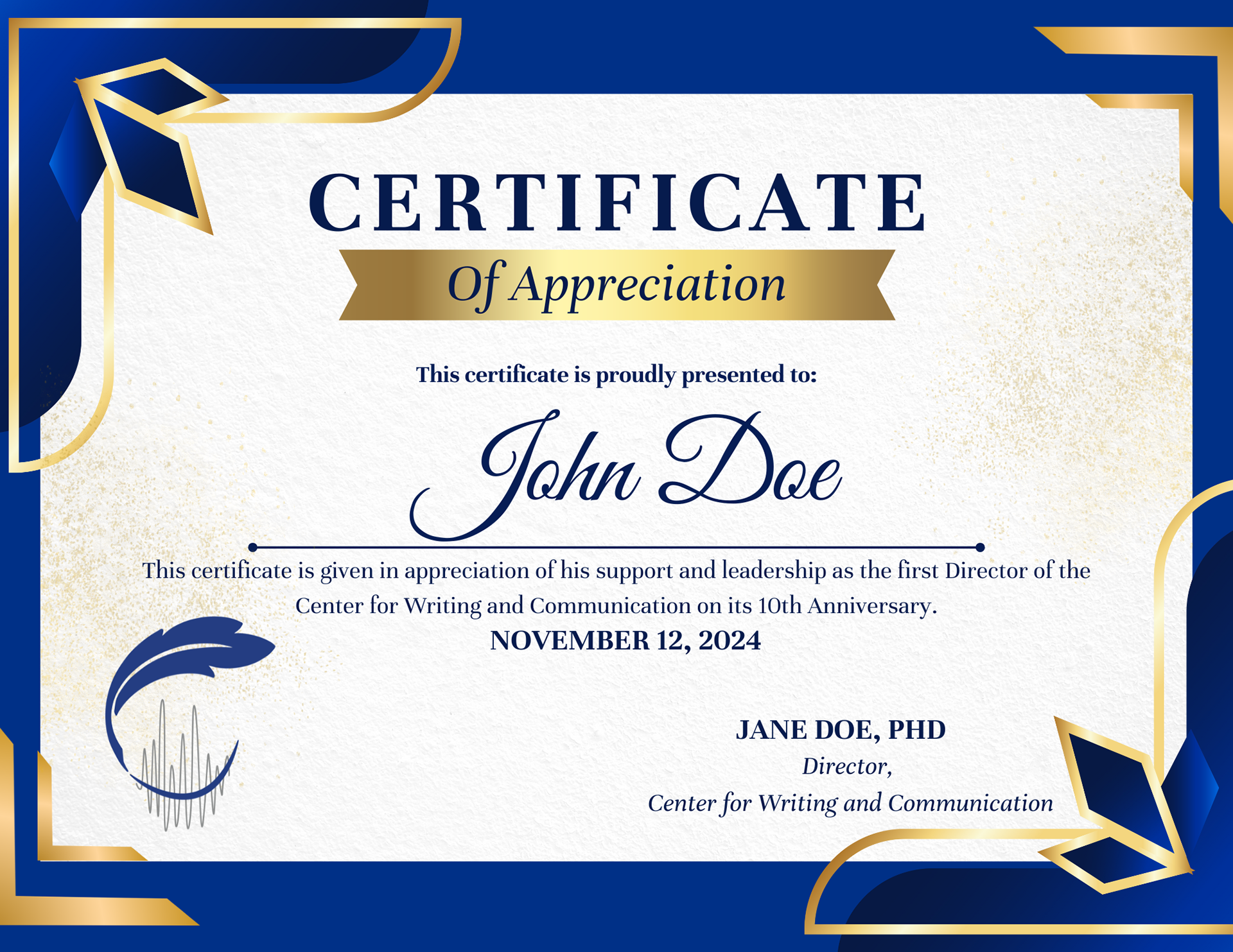
Before: Overly intense colors, misaligned layout
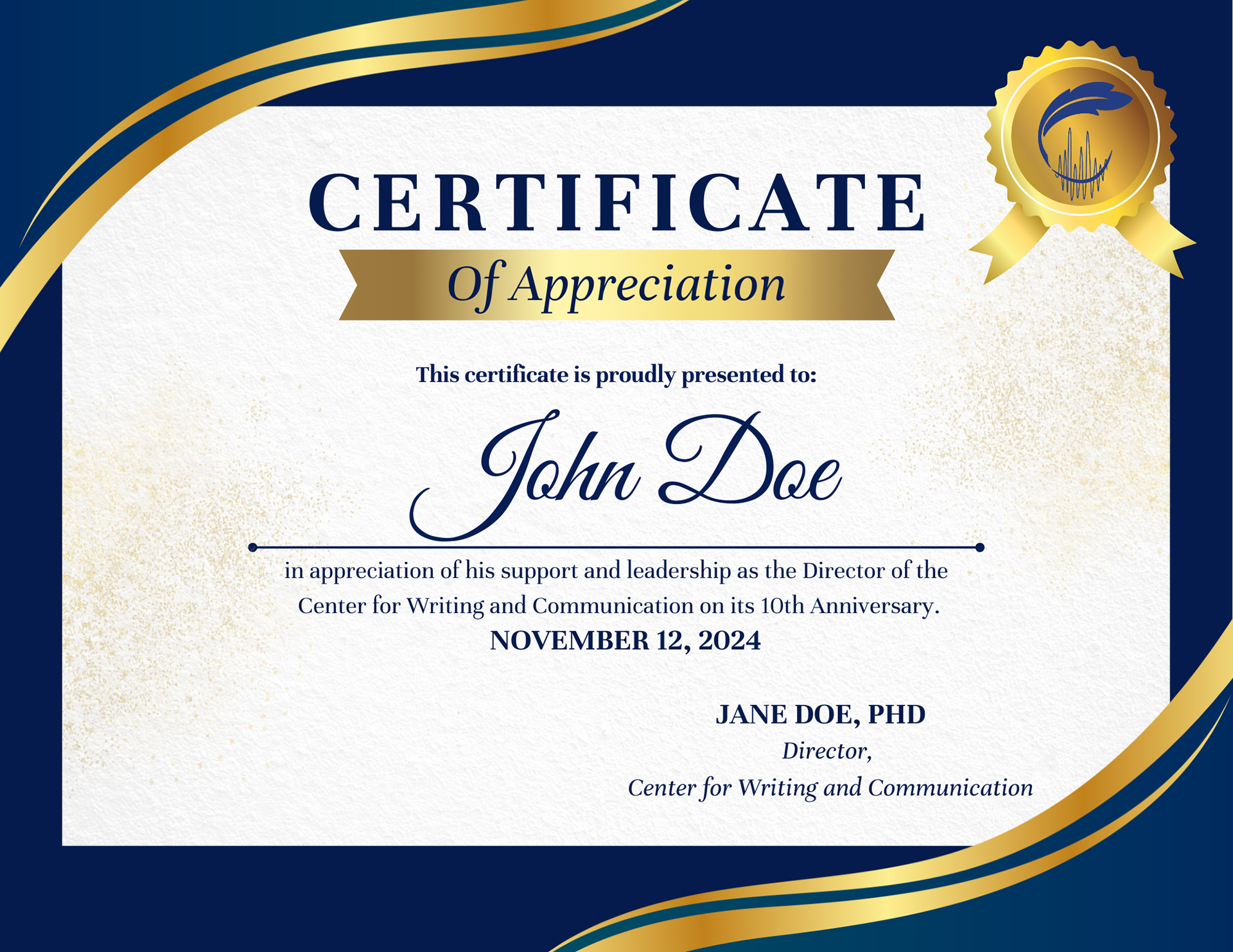
After: Simplified, professional design with balanced alignment

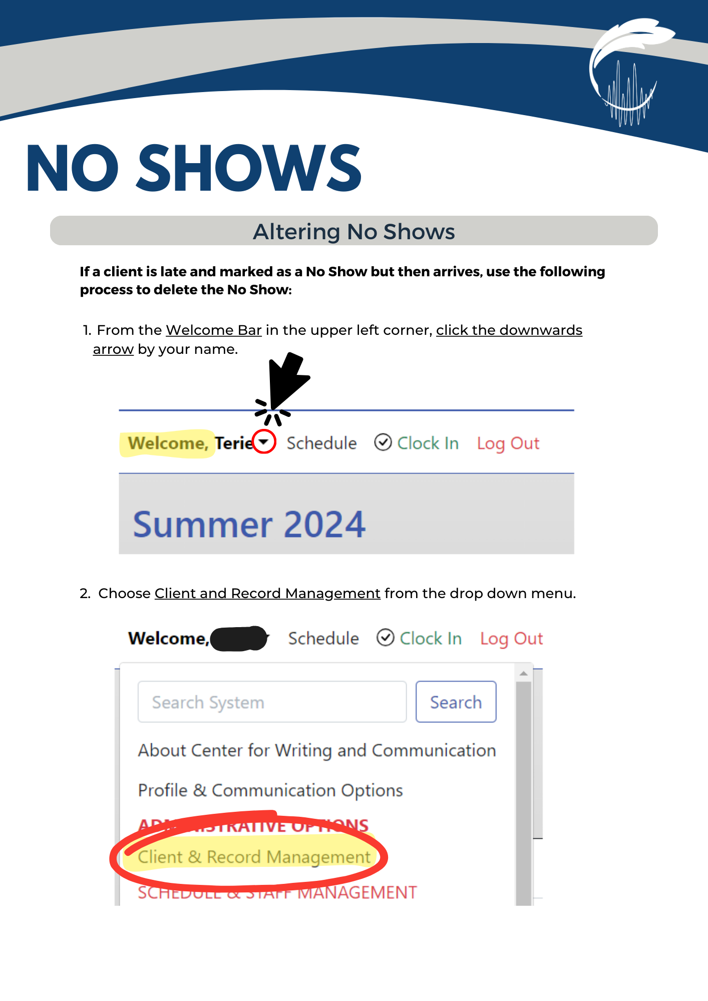
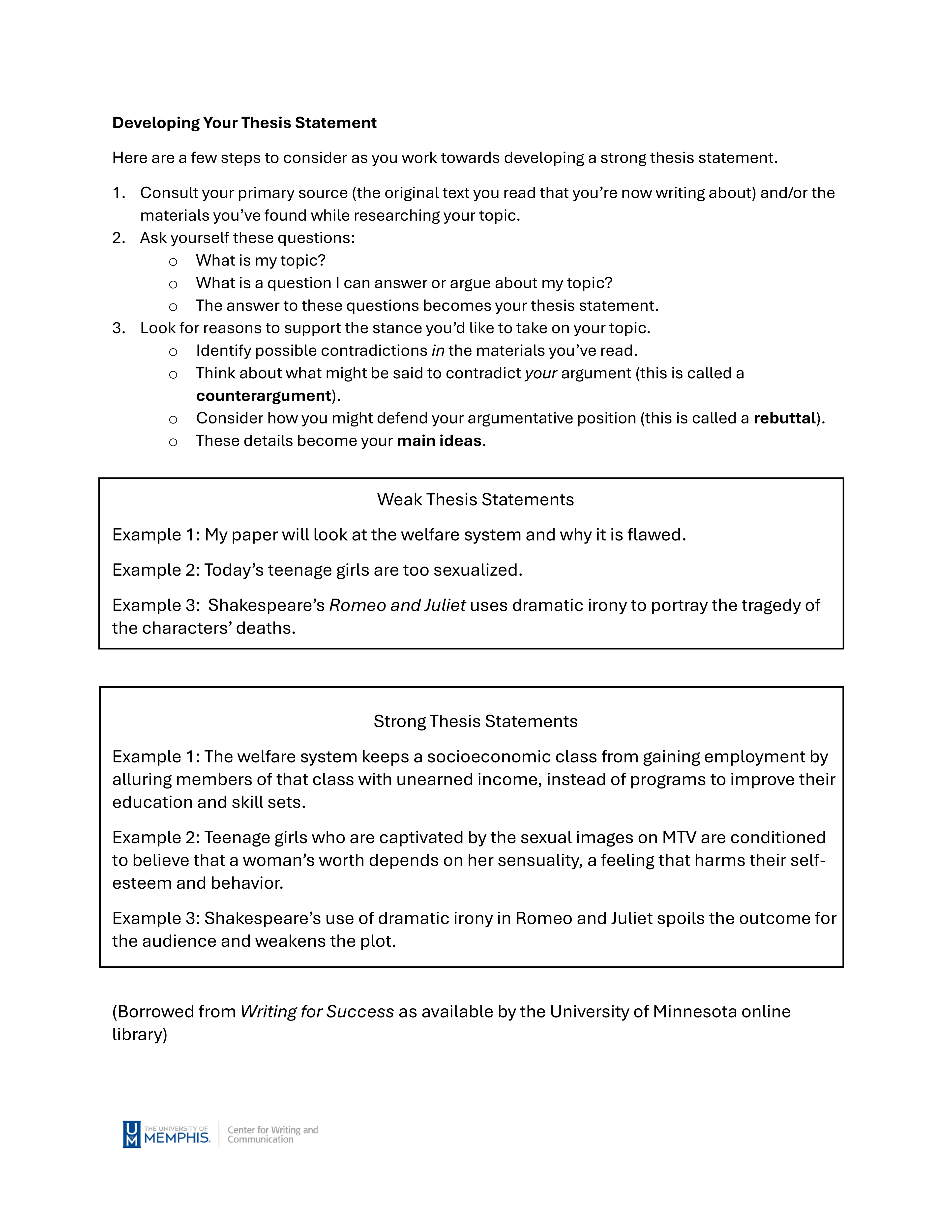
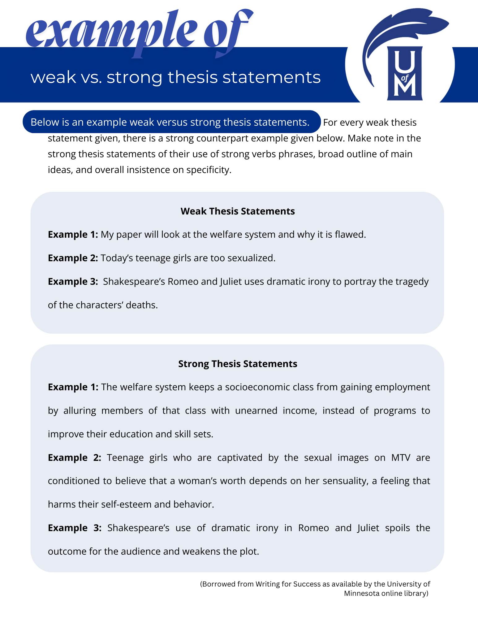
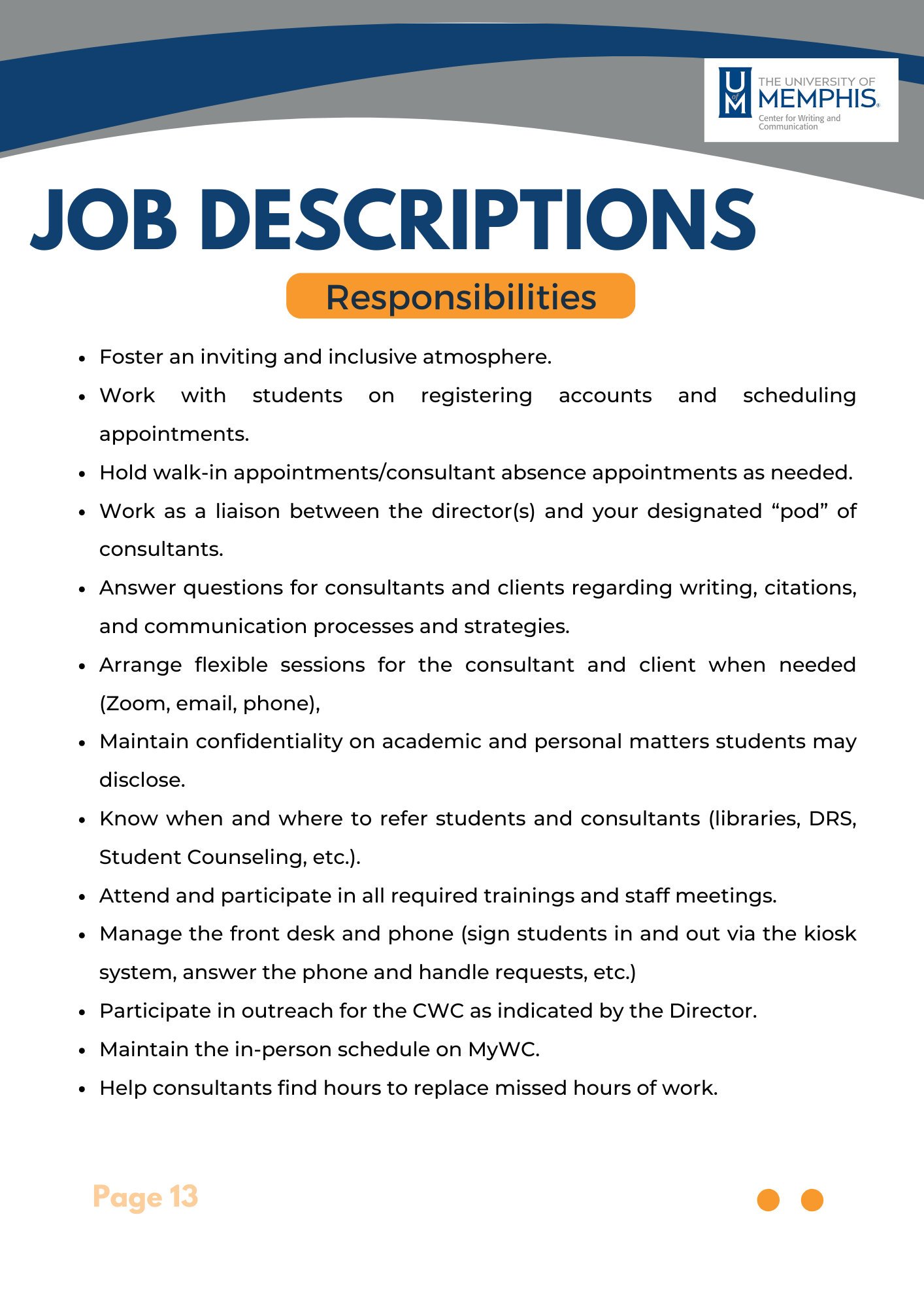
Student Guide Redesign
Transformed dense, text-heavy guides into clear, engaging, and accessible materials. Introduced a flexible header system (“Let’s Learn,” “Example Of”) to ensure brand consistency across future handouts.

Before: Dense, text-heavy layout

After: Clear, student-friendly redesign
Before: Blocky layout, limited visual cues
After: Accessible design with distinct sections

Employee Handbook Redesign
Redesigned the handbook using brand colors and updated the layout for better visual balance. Incorporated the new logo to create a cohesive, streamlined look.

Before: Outdated design, minimal brand integration

After: Streamlined, cohesive brand-aligned layout
Improved readability and flow in text-heavy sections by applying typography principles and visual hierarchy. Grouped information into clear categories and added natural breakpoints to guide the reader.
Before: Blocky text, limited hierarchy

After: Improved readability with clear typography + hierarchy
Simplified a cluttered task checklist using a grid system, added a notes section for flexibility, and improved usability through clear layout and visual hierarchy.

Before: Cluttered, hard-to-follow checklist
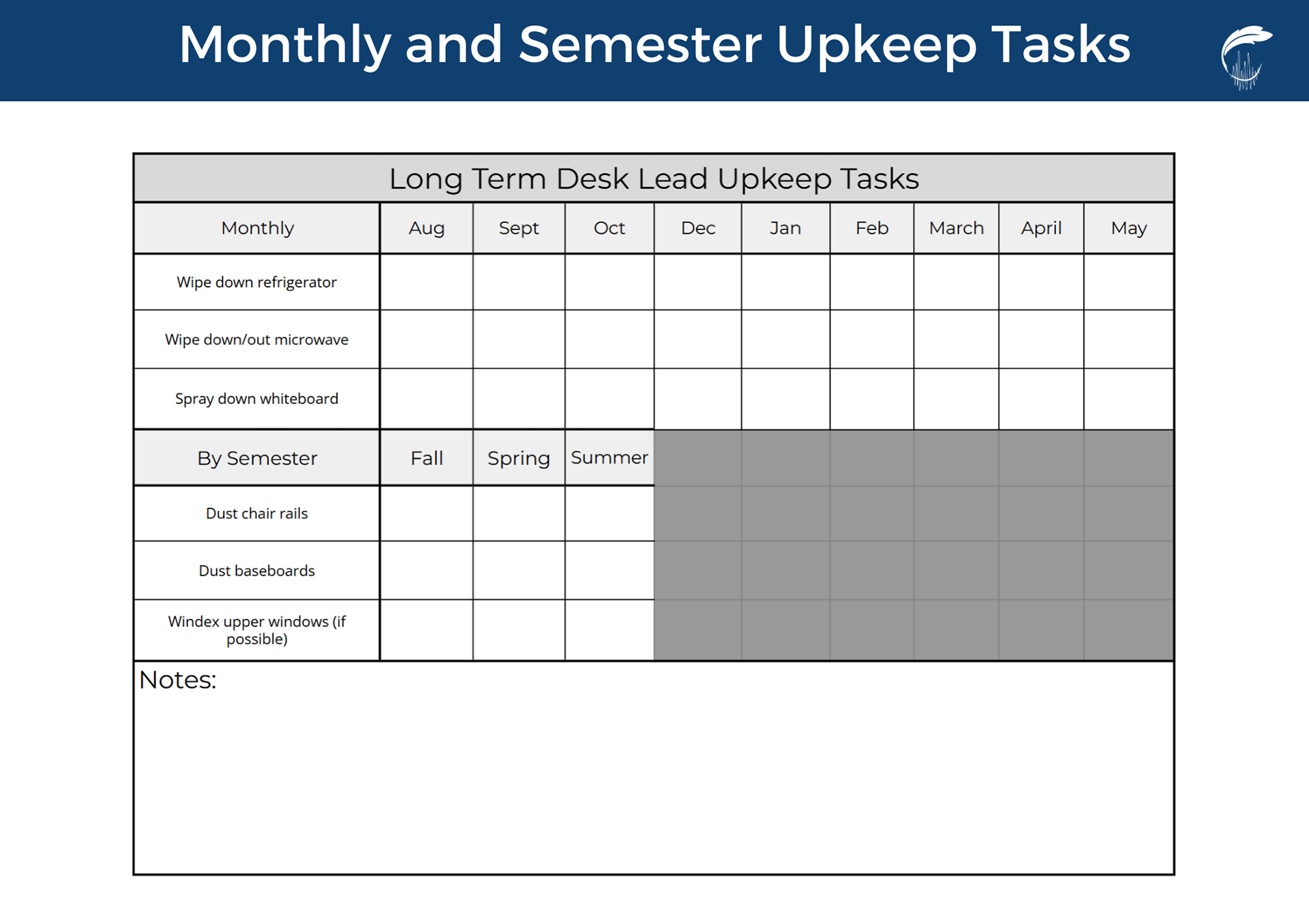
After: Simplified layout with grid + notes section
Redesigned technical guides to improve clarity, flow, and user-friendliness for non-technical audiences. Focused on simplifying complex instructions and creating layouts that support easy navigation.
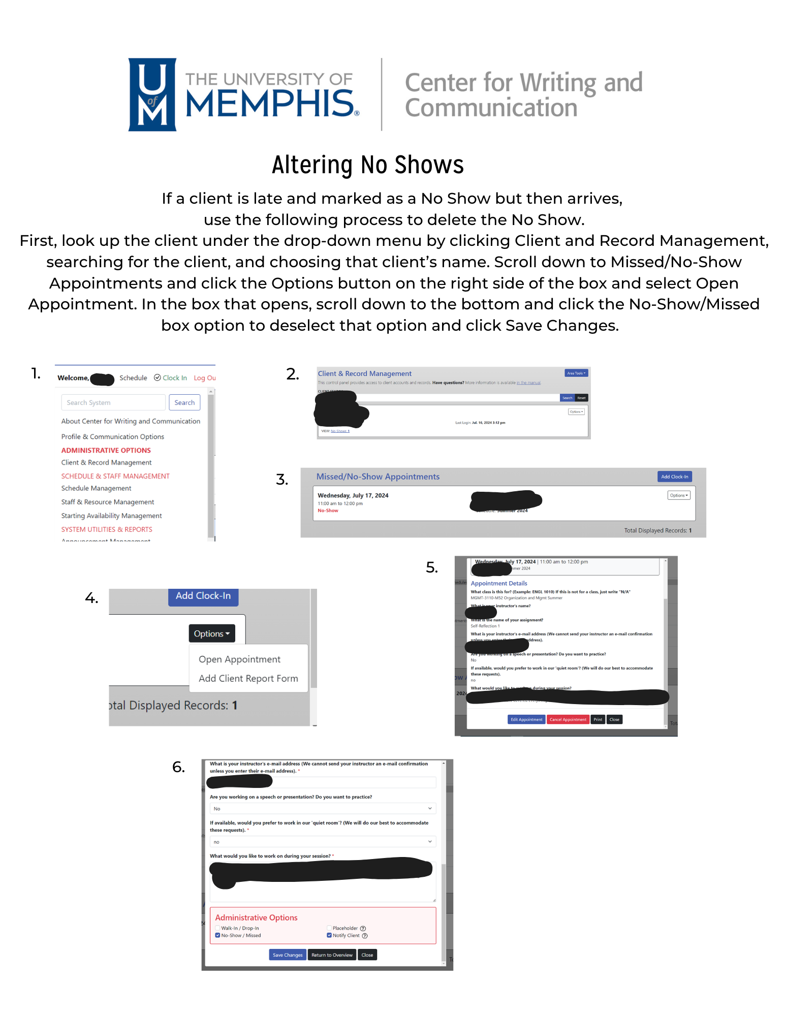
Before: Complex instructions, minimal structure